Lets make an Infographic Resume with Power BI Pro

This time, I will be using Power BI Pro and Power BI Desktop to create an Infographic Resume
Things to prepare…
- Power BI Desktop
- Power BI Pro
*You can use a trial version of Power BI Pro if you don’t own one.
STEP1:Create the base info
Use excel to create tables with info like below.

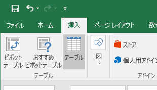
You can use a table tool to rename the tables.

You can add more by clicking on Insert, Tables for more.

STEP2:Import to Power BI
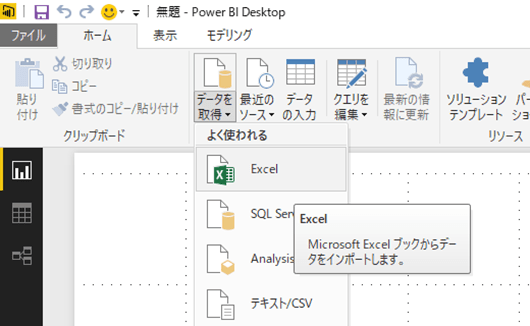
Now we’ll import the excel to Power BI.
Start up Power BI Desktop

Select the Excel file we just made.

Check if it is imported correctly with Navigator.
Select the tables you’d like to import.

Once imported, it should be showing up as fields on the right!

STEP3:Visualize the data
| Select the graph
|
Drag and drop like pivot tables in Excel
|
Drag and drop legends too.
|
| Change the size
|
Change the layout/formatting
|
And the graph is made!
|
Once combined, it looks like below…

But it doesn’t look that well. The next step is to use the “Custom Visuals” – it allows you to use graphs that aren’t available with normal Power BI.
Search for “Microsoft Office Store” to access it.
There are lots of Custom Visuals available for free!

The one I’m going to use is the “Gantt”

Click on the graph and you will see the screen below. Click on “Add”

Unfortunately, it does not automatically install into Power BI. Click on the download link.

Next go back to the Power BI Desktop. Click on “…” and select “Import custom visual”.

Select the file we’ve just downloaded and should see the screen below.

Now a new “Gantt” graph should show up.

Before we use it, we need to modify the data from Excel.
Gantt requires “Start Date” and “Duration” but the excel file only has start and end dates.
To calculate, we can use Power BI functions without editing the original Excel.
Click on “data” in the top left.

Click on “Modelling” tab and “Add new column”

You can calculate just like you do in Excel!

but the values don’t look right…

So we just change the data type to “Integer”

Now we’re ready.

Go back to report mode.

Drag and drop like below.

Change the “Gantt Data Type” to “Year”

And now the gantt chart is ready!

We just need the name, title and a photograph…
You can insert photos by clicking on “Image”

And we’ve finally made it!

STEP4:Publish to Web
Before we publish, you need to publish to Power BI Service first.
Click on “Publish”

You’ll be asked to login so enter the Power BI Pro account details.

Select the workspace to publish to. By default it’s “My Workspace”

Publishing will begin.

Once complete, window like below should show.

Now it’s uploaded to Power BI service.

Now we are finally ready to publish to web.
Click on Publish to web.
*Note that anyone who will know the link will have access to your resume.

Click on “Generate embed code”

Click on “Publish” to confirm

The link is created!
You can share it via email, or use iframe and embed it to your blog/website.


面白そうなので試してみようと思いましたが、STEP1で説明されている元ネタのExcelテンプレートが見当たりませんでした。どこからダウンロードできますか?
ご指摘ありがとうございます!
記事からファイルへリンクさせましたので、もう一度ご確認下さい。
とても面白いので、社内勉強会で使い道のひとつとして紹介したいのですが、
最初の画像を使わせていただくことは可能でしょうか?
遅れてすみません(^^; ぜひご利用ください!